
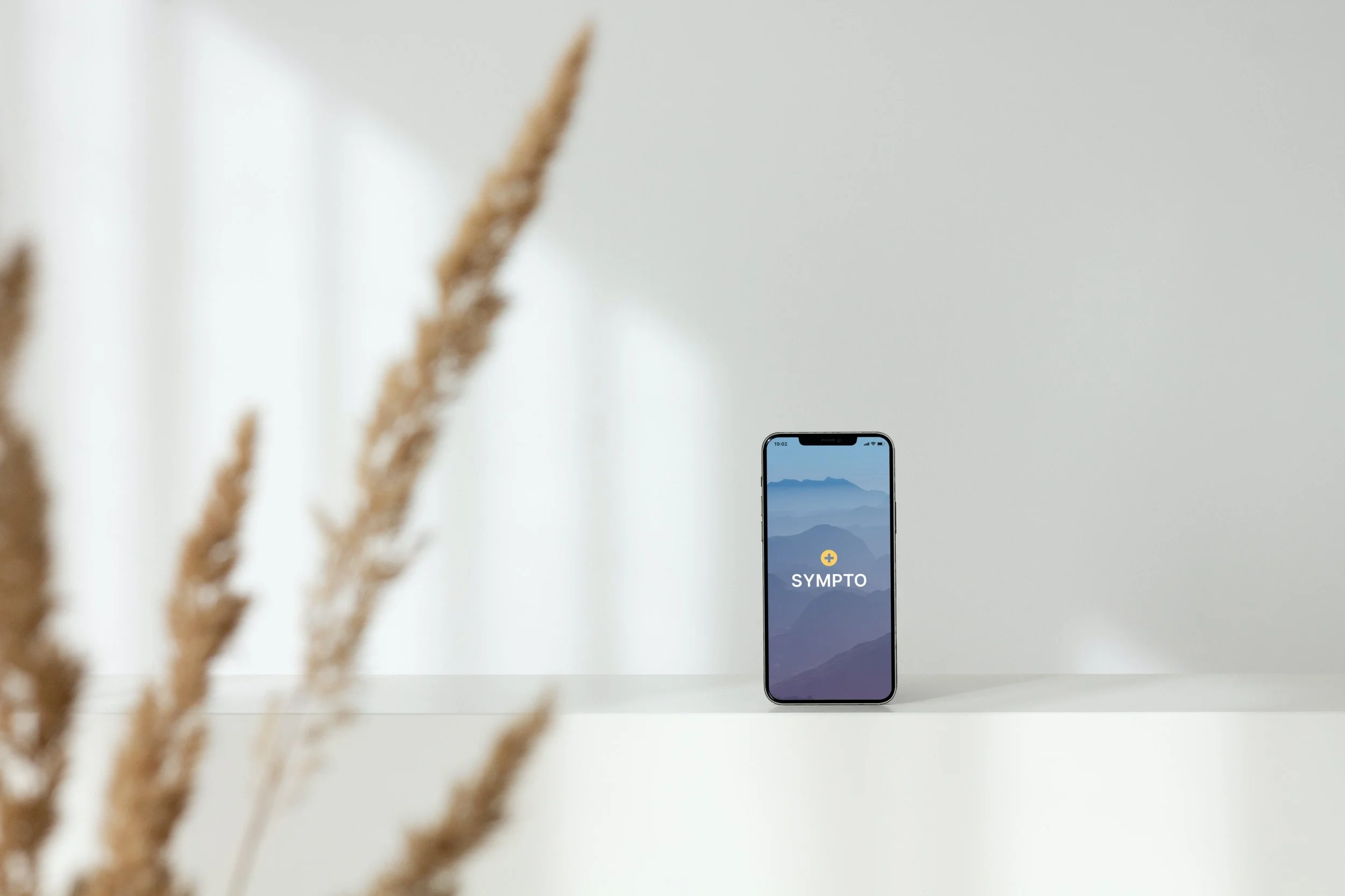
Health management for the whole family.
Project Overview
About: Project at Careerfoundry
Timeline: Sep 2022 — Mar 2023
Role: UX Designer
Introduction
Managing multiple family members' health and medical information can be daunting and challenging. Failing to organize and coordinate medication, appointments, and medical records can lead to confusion, missed appointments, and potential health risks.
Additionally, many existing health management apps are geared towards individuals, leaving families without a comprehensive solution to their needs. As a result, there is a clear need for a user-friendly, intuitive, and secure app that can help families manage their health and medical information in a centralized and efficient way, saving time and reducing stress.
My Role
I was the lead designer on this project. I collaborated with UX designer mentor Irisi Tole and tutor Dylan Scacchetti throughout the project.
Problem
Our users need a tool that organizes their health and medical information, as well as their children or elders, in a way that is easy to understand because having a medical history in one place makes it easier to communicate concerns with medical experts.
We will know this to be true when we see our users have better appointments with medical experts and make informed decisions about their health.
1 Discovery
Competitive Analysis
Prior to commencing my project, I conducted an analysis of the competitive landscape in order to gather valuable insights. Through this process, I discovered that there were several health applications available in the market. However, upon careful examination, none of them presented themselves as significant competitors. This was primarily due to the poor quality of the user experience, which was characterized by substandard design and a high level of complexity that rendered them difficult to use.
Preliminary Survey
To ensure that the problem statement was grounded in empirical evidence, I conducted a survey. This enabled me to collect reliable data from a representative sample of the target audience, providing a solid foundation upon which to formulate the problem statement.
The goal was to understand the pain spots and frustrations of managing health and medical information.
The Results

User research
Armed with preliminary data, I proceeded to conduct user interviews to understand how parents manage their family's health information, identify pain points in managing health for multiple people, and discover ways in which a tool could alleviate these pain points.
User Research Findings
Affinity Map
2 Define
User Personas
Having gained a comprehensive understanding of the target user base, we proceeded to create a couple of personas based on our research findings.
User Journeys
After identifying our user base, we created user journeys to gain a deeper understanding of the motivations behind their actions.
Information Architecture
In order to ensure that the navigation of the website feels intuitive and seamless, it was imperative to address the multitude of logging categories. To accomplish this, a card sorting session was conducted to determine the optimal organization of all pages.
Online Card Sorting
Before Card Sorting
After Card Sorting
The sessions revealed some clear groupings. Mainly, people categorized medical records/history as separate from ongoing health issues that require logging and doctor visits.
Navigation is easier when pages are sorted into fewer categories that make sense. These card-sorting findings made it clear how each of these pages should be grouped.
In Person Card Sorting
The in-person card sorting session aided in further refining the information architecture, revealing that the majority of content can be categorized into two primary groups: "action" and "record."
As online card sorting does not facilitate follow-up questions, a final in-person card sorting session was conducted to ensure a comprehensive analysis.
3 Design
Wireframes
Low Fidelity
After conducting card sorting sessions, I was equipped with some data on how to organize the information architecture. Now that I knew how to group my pages I had to find where and how to place them. Low-fidelity wireframe sketches gave me a risk-free environment to work through numerous ideas. The biggest challenge was how to organize numerous patients’ medical information. Sketching them out helped me vet out some of my ideas to quickly see what worked and what didn’t.
Mid Fidelity
Now that I had a better idea of how and where to place the different navigations I took the time to lay it out in mid-fidelity in order to create an MVP. My biggest concern continues to be optimizing navigation to minimize cognitive load. Halfway through creating the mid-fidelity wireframes, I felt the navigation could be better and after consulting with my tutor we decided on a menu drawer that housed all patient-specific pages.
update: After making the interactive prototype, I went back and added a “home” button in the main navigation as this will be more intuitive for users. This change will be reflected in the next interactive prototype edit.
Prototype
Now that I had mid-fidelity wireframes, I was able to create an interactive prototype with the plan to test it out with some of my potential users.
update: Seeing mid-fidelity wireframes in a prototype helped me see the holes in navigation. For example without a “home” button, when visiting the “upcoming” or “settings” page, it was unclear where I should go next. I plan to add a new “home” page in the next iteration.
4 Refine
User Testing
This test aims to assess the learnability of new mobile users interacting with the family health management application for the first time.
It will reveal if users understand the product, its value, and how to complete basic initial functions such as logging in, searching for/navigating between patients and adding medical logs.
Test Results
To understand my findings from the usability test, I used card sorting and organized each item into a rainbow spreadsheet. This helped me see which items to prioritize in my next iteration.
Design Iterations
ISSUE 1
Unable to find where to add post-appointment notes.
Suggested Change
Give a visible queue in the captured appointment to show if appointment notes were captured.
Evidence
80% of users had difficulty locating where to add post-appointment notes. At least 40% of users needed the moderator’s help to land in the right place.
Before
After
ISSUE 4
Difficulty understanding what type of information is captured in the different categories.
Suggested Change
Create removable coach marks under each category, outlining examples of information that can be captured. Also, maybe creating better sample logs as examples.
Evidence
At least 80% of participants displayed a minor to medium amount of confusion about what type of information goes into the different categories.
Before
After
Branding Guidelines
Final Screens
What's Next?
Lessons learned
I gained a comprehensive understanding of the entire design cycle and how to effectively employ various UX artifacts. By conducting user research, I obtained valuable insights that significantly enhanced the app's functionality.
It's essential to recognize that design is an ongoing learning process rather than a fixed solution. Thus, it's more crucial to showcase the design process than to strive for a perfect outcome.
What’s next
I plan to finalize the design and conduct further testing to ensure optimal performance and user satisfaction. The primary focus of the study was the mobile application; however, I aim to extend the learnings to develop a web application as well. By implementing the insights and recommendations obtained through user research, I hope to build out additional features and improve the overall user experience of both applications.