

Improving Nadiya app’s onboarding experience
About
Phase 2 of Nadiya app
Timeline
Jan 2023 — Jun 2023
Role
UX Designer
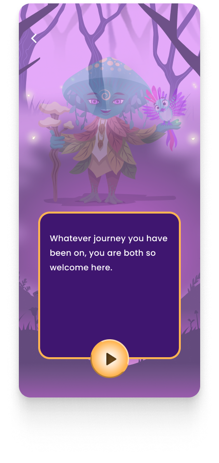
About the App
Apart of Me is an app that supports young people dealing with grief by offering a virtual world filled with activities and resources. Users can explore their emotions, connect with others, and find coping strategies. It provides a safe space to express feelings, reflect on memories, and access guided meditations for self-care. Overall, Apart of Me serves as a digital companion to help young people navigate the grieving process and find support.
My Role
I joined the team as a UX designer to help the onboarding team lesson the friction users were experiencing resulting in low onboarding rate.
Problem
Today, only 14.11% of users complete the first charm together and plant a plant that marks the end of onboarding. The team has identified that the current onboarding flow for Nadiya app was not engaging enough for users, resulting in a low retention & activation rates. The Nadiya team is looking for new and innovative ideas to improve the onboarding flow, making it more interactive and engaging.
Multiple text heavy screens
The onboarding process is long with seemingly endless screens to swipe through. This makes the process feel tedious involving repetitive swiping motions.

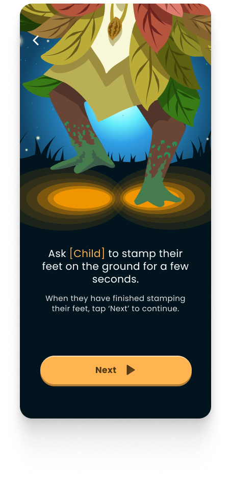
Missing playful interactions
The app is designed for young children but lacks elements of fun and playfulness. This makes it challenging for children to engage and stick it through to the end of onboarding.
No visual progress
There are no visual queues that let users know how far along they were in the onboarding process or in any of the exercises.
Research
Competitive Research
To better understand the gaps in Nadiya’s onboarding, I conducted a competitive research to assess what our competitors were doing.
Then I summarized these findings into bite size pieces so that we could synthesize into an affinity map with the hope of gleaning key insights.
Some good takeaways we learned from the competitive research was that:
Asking users’ goals helps provide clear reason to use the app.
Letting users experience the value of the app will encourage users to stick around.
Communicate benefits of registration when asking for user’s email.
Animation makes for a fun, immersive and engaging experience
Give users control over what exercise to engage with instead of the current linear story style.
Show progress bars whenever appropriate so users know where they are.
Friendly and approachable chat based UI is a better alternative to multiple text heavy slides.
User Research
Now, to dig deeper into understanding how our users experience Nadiya’s current onboarding, we conducted user research 7 parent and child groups. The goal was to observe the parent and child groups navigate Nadiya’s onboarding to see what they say, think, and feel.
These qualitative data points were then organized into a SWOT analysis so we can prioritize. What we found through this exercise was that. While none of these findings were surprising it was essential that we validate our hypothesis.
Design Ideations
Early Ideations
Next, we took time to individually sketch our ideas to and let our creativity flow!
⌛ Work in Progress ⌛
Stay tuned for updates and improvements. Can't wait to share more about the project as we progress!